MRT Map Version 3 Includes Johor’s BRT Line
A previously-undiscovered passion for the MRT map and its original meh and messy design has surfaced this past year, with multiple redesigns going viral on the Internet.
Remember that MRT map redesign that featured an actual circle for the Circle Line? That designer, Faiz Basha, came back on 10 Aug just in time for National Day with a new version of the map, with more improvements and with a design tailored to the actual shape of Singapore.
![]()
You can get a better look at the map through this link.
The redesigned map now takes into account the Land Transport Authority’s Land Transport Master Plan 2040, with the following planned:
- New MRT stations on the North South Line (Brickland and Sungei Kadut)
- New interchange connecting to the Downtown Line
- Thomson-East Coast Line extension
- Cross-Island Line connecting to Punggol
2040 might be at least 20 years from now, but the future of the MRT map has arrived.
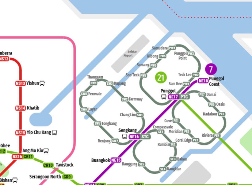
Geographical accuracy of various landmarks
Faiz has taken care to not only maintain the circular shape of the Circle Line, as with previous designs, but also include the shape of our little red dot and landmarks such as waterways around the Sengkang-Punggol region.
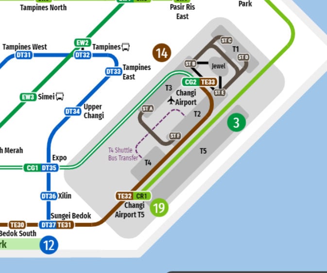
The layout of Changi Airport has also been included, retaining the relative locations of the MRT stations. The size of Changi Airport has been increased on the map as the metro lines are still the priority.
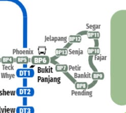
However, we’re not so sure about the geographical accuracy of this seemingly heart-shaped LRT line in Bukit Panjang.
Proposed Johor BRT line included
In May 2019, Johor announced that a Bus Rapid Transit (BRT) service would be built and completed by 2022, with possible links to Singapore’s existing MRT service through the High Speed Rail (HSR) and RTS Link.
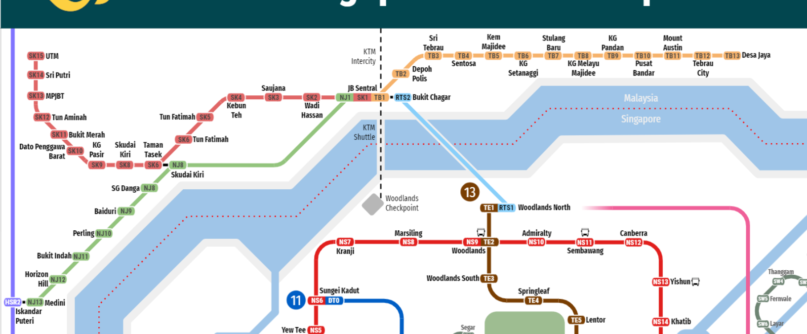
Faiz has included the BRT lines around the Johor Bahru (JB) area on the map, which Singaporeans visiting JB will likely appreciate.
A minor misspelling
The map looks amazing, although some might argue that the previous version with its whiteness and very circular Circle Line is better.
However, there is but a single error: the existence of Toy Payoh as opposed to Toa Payoh.
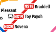
Oops. Perhaps a Greater Singapore transit Map [Edit 4.0] is in order.
Just kidding, we love the map and reiterate our desire to see LTA adopt one of these awesome designs, even if they’ve announced their own revamp to be released later this year. Good job once again, Faiz!
Featured image adapted from Wikimedia and Facebook.

Drop us your email so you won't miss the latest news.


