
Charles & Keith has new emblem for Spring 2024 collection
Local brand Charles & Keith’s new L’initial emblem has recently been incorporated into its Spring 2024 collection.
Source: Charles & Keith Singapore
The brand highlighted that the initials used in the new emblem were “distinctive and timeless”, and hopes that the rebranding will enhance its identity.
Customers, however, had mixed reactions towards the new design. While some felt it appealed to them, others did not take so well to the change.
New Charles & Keith emblem disappoints some customers
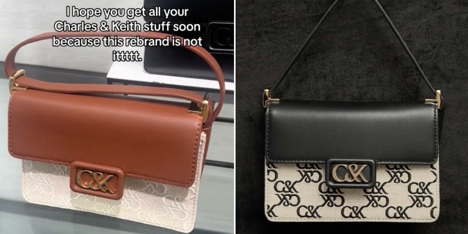
On Saturday (9 March), TikTok user @deedodum shared a video of the collection, which features the new L’initial emblem on products such as shoes, bags, and purses.
@deedoodumthe logo is giving ✨auntie✨♬ original sound – dee
In her in-video caption, she remarked: “This rebrand is not it.”
Netizens in the comments section had mixed opinions towards the new design.
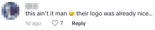
Some users echoed the same sentiments as the user, feeling that the emblem was not up to par with their expectations. One user shared their disappointment, as they preferred Charles & Keith’s existing emblem.
Source: TikTok
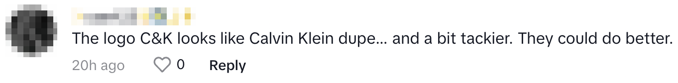
Another netizen pointed out that the new emblem bears similarity to Calvin Klein’s, another fashion brand. They also lamented that Charles & Keith’s version was “a bit tackier”.
Source: TikTok
Others like the new design
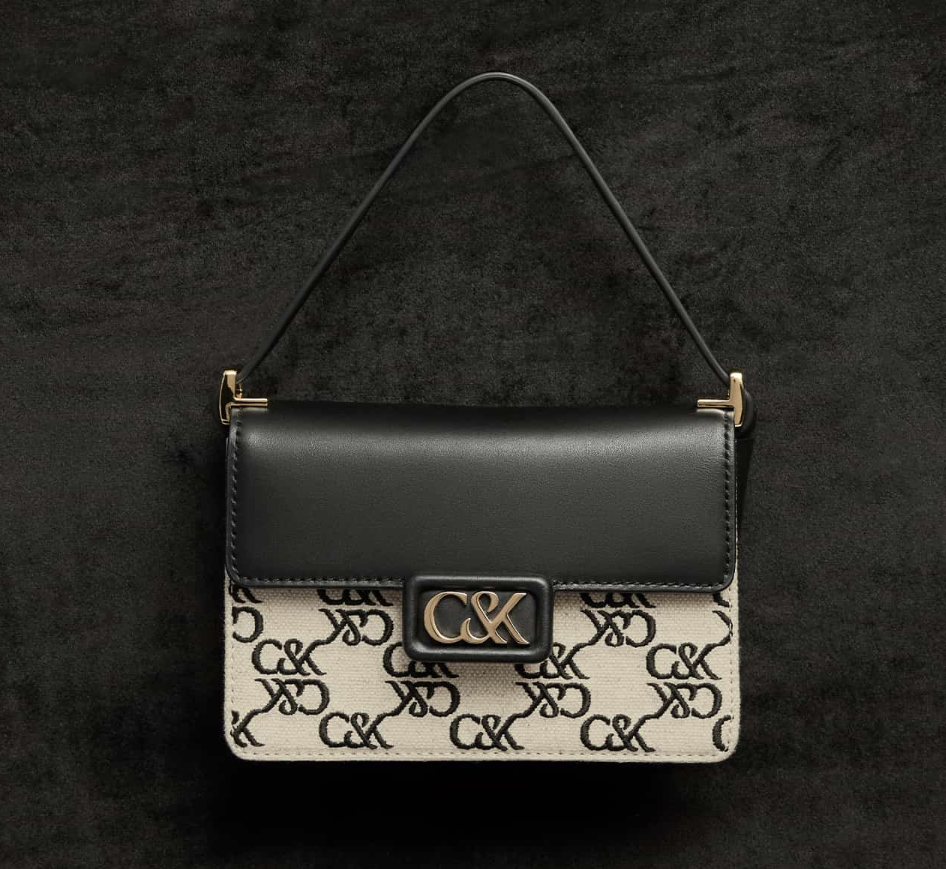
On the other hand, others liked the rebranded design. In particular, one user was attracted to the elegance of the new design.

Source: TikTok
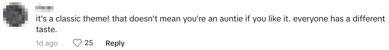
Another user said that the new version was a “classic theme”. They also reminded other commenters that everyone has unique tastes.
Source: TikTok
MS News has reached out to Charles & Keith Singapore and the TikTok OP for comments.
Charles & Keith kickstarts new year with ‘revitalised graphic identity’
The new product line is a part of the brand’s graphic identity refresh.
“We are excited to start a new chapter and present the redesigned logo in tandem with our first-ever emblem and monogram,” said brand co-founders Charles and Keith Wong in a press release seen by MS News.
“Each element was thoughtfully designed, an ode to our beginnings with the inclusion of our initials, the ampersand reflecting the brand’s natural duality.”
The brand’s new visual branding will be reflected across retail, communications, and packaging touchpoints.
On its website, Charles & Keith noted that the new emblem “pays homage to the classic Futura font” while venturing into “new territory”.
“Through the incorporation of curved lines and innovative elements, we seek to elevate our brand identity and propel it towards a future of boundless creativity and innovation.”
Also read: Teen Mocked For Calling Charles & Keith Bag ‘Luxury’, Explains She Didn’t Grow Up Privileged
Teen Mocked For Calling Charles & Keith Bag ‘Luxury’, Explains She Didn’t Grow Up Privileged
Have news you must share? Get in touch with us via email at news@mustsharenews.com.
Featured image adapted from @deedodum on TikTok and Charles and Keith Singapore.