
Hilarious PAP Vs WP Brochure Showdown By Netizen
Unboxing something that has arrived at your doorstep can be a thrilling experience.
For this netizen, it entailed pitting Workers’ Party and People’s Action Party brochures against each other — page for page.
Besides digesting the policies on paper, the voter went a step further & broke down paper quality, design & language choices as well as a no holds barred review of what he’d do to recycle them after GE2020.
Here’s his post in full, we summarise it after the jump.
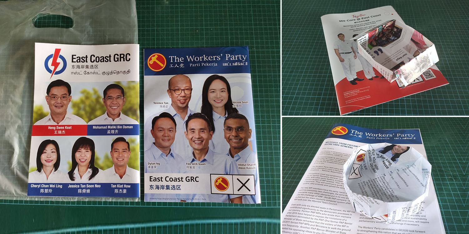
Single use plastics or rain-proofing
The netizen chose to pit WP and PAP’s brochures against each other in methodical fashion.
He received PAP’s brochure “in a plastic bag” to keep it rain-proof, while WP’s plan did not come with one & was “wedged in between” the gate.

Although he preferred PAP’s more elegant approach, the plastic bag was a “single use item” that didn’t fulfill “a major function”.
For voters who told him they didn’t receive a plastic bag with PAP’s brochure, the netizen had this to say,
Please contact your local PAP representative for a plastic bag.
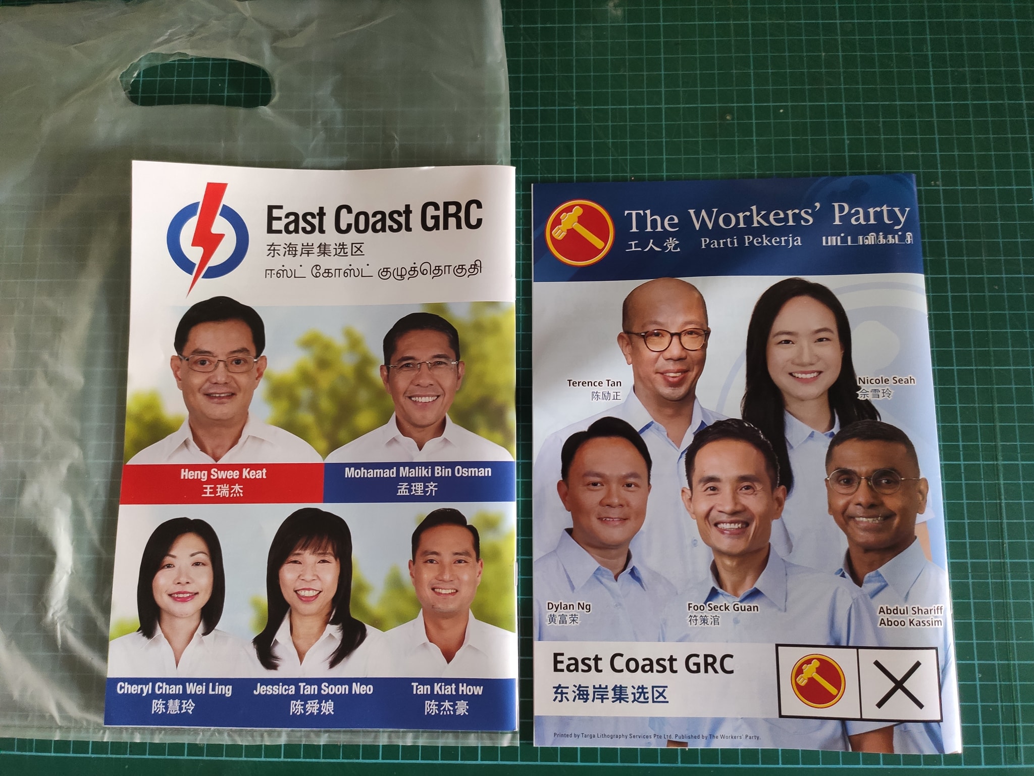
Paper quality & language choice in party brochures
As for paper quality, the netizen shared that both utilised coated paper at these Grams per Square Metre (GSM) metrics:
- PAP – 80 GSM (higher quality) at 16 pages
- WP – 60 or 70 GSM (lower quality) at 8 pages
Although he opined that PAP’s brochure was sturdier, it may not have been necessary to prevent paper wastage.
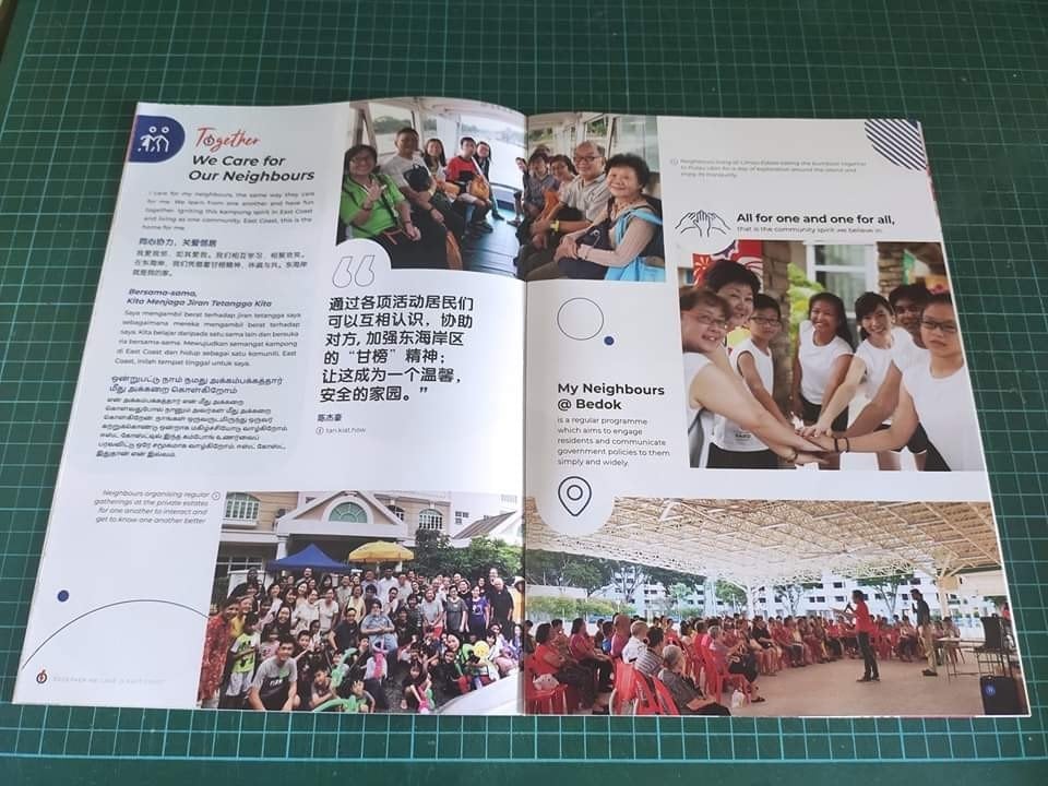
The netizen also shared that he appreciated the pictorial approach by PAP & 11 point font size text.
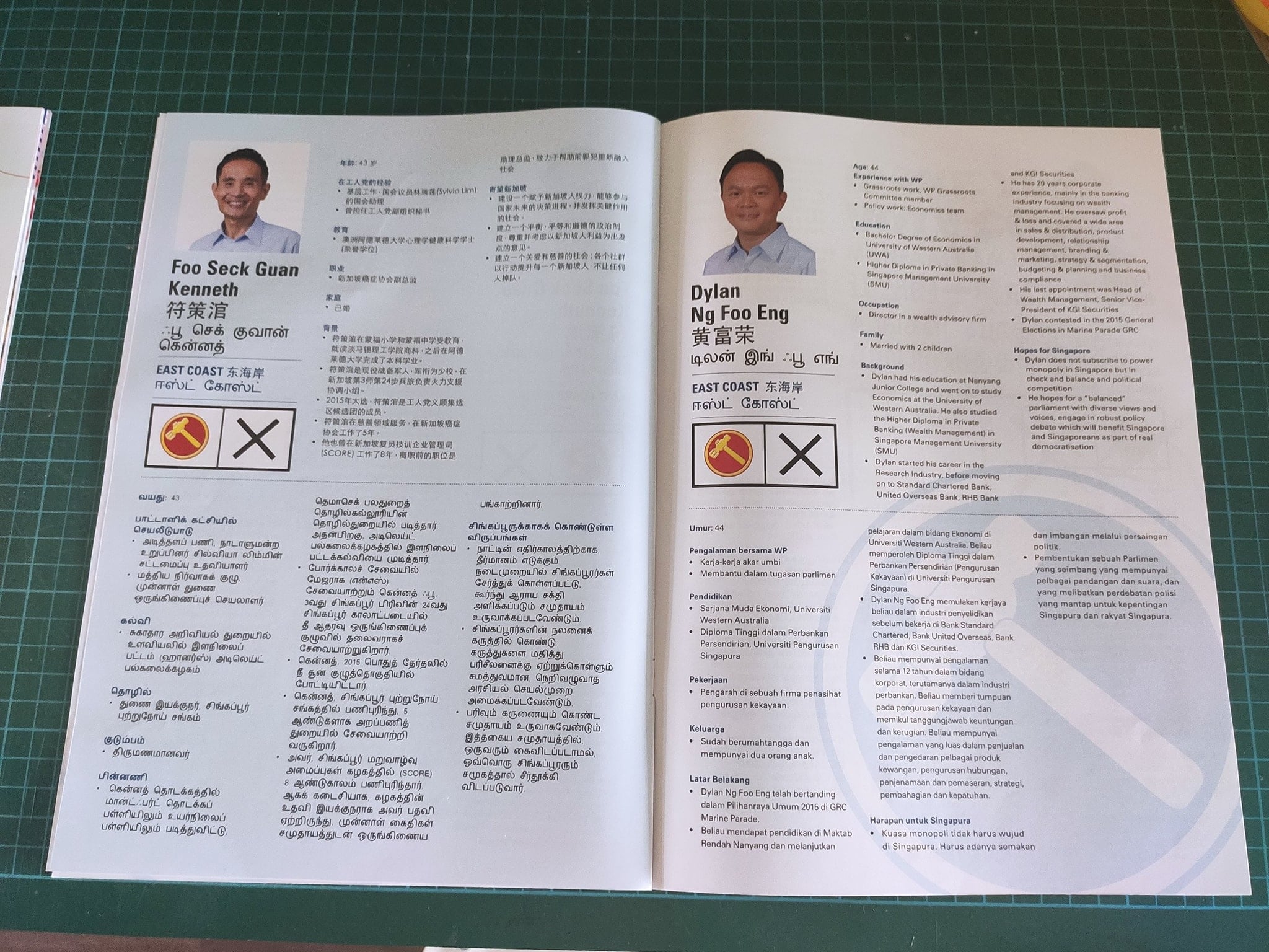
As compared to WP’s 10 point font size, both were perhaps still too small for senior residents.
The final verdict on this, however, was that increasing the font size did not “justify twice the page count”.
No gender or status differences in WP design
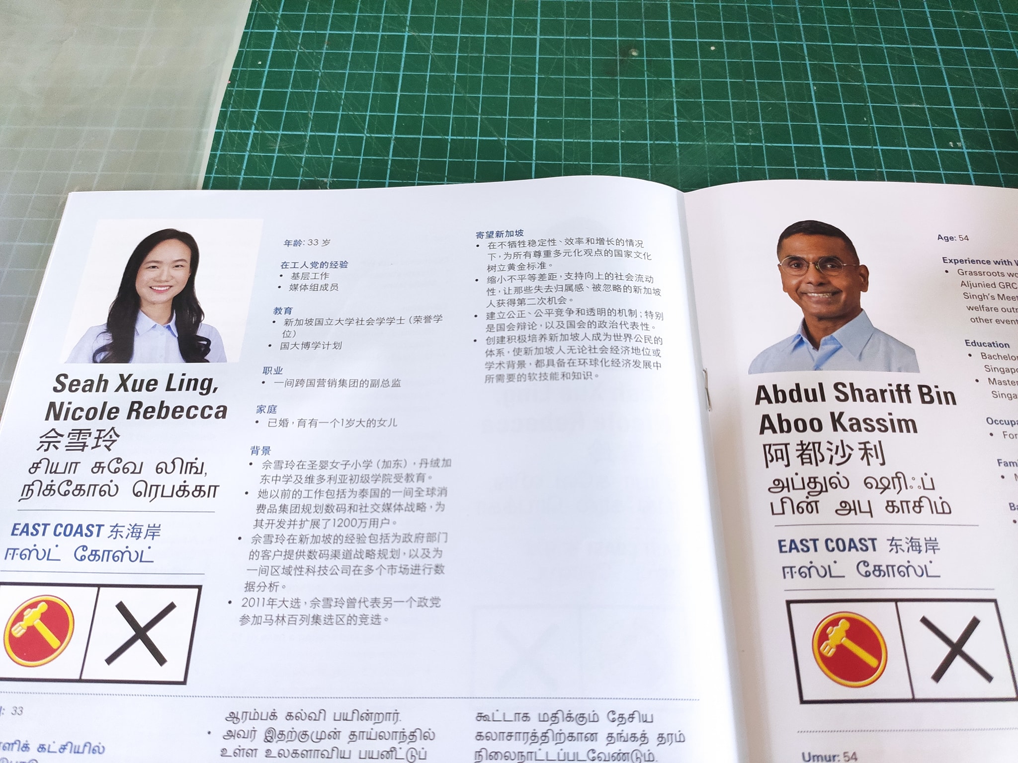
Next, the netizen critiqued the demarcation of who’s the ‘leader’ in the GRC candidate slate.
For PAP’s brochure, he shared that their leader was “clearly marked red” while WP used a “team approach to their photochopping”.
Commenting on the design choices, he quipped,
This is a GRC, not an SMC. Candidates are voted upon as a team, not as individuals.
Language order was different
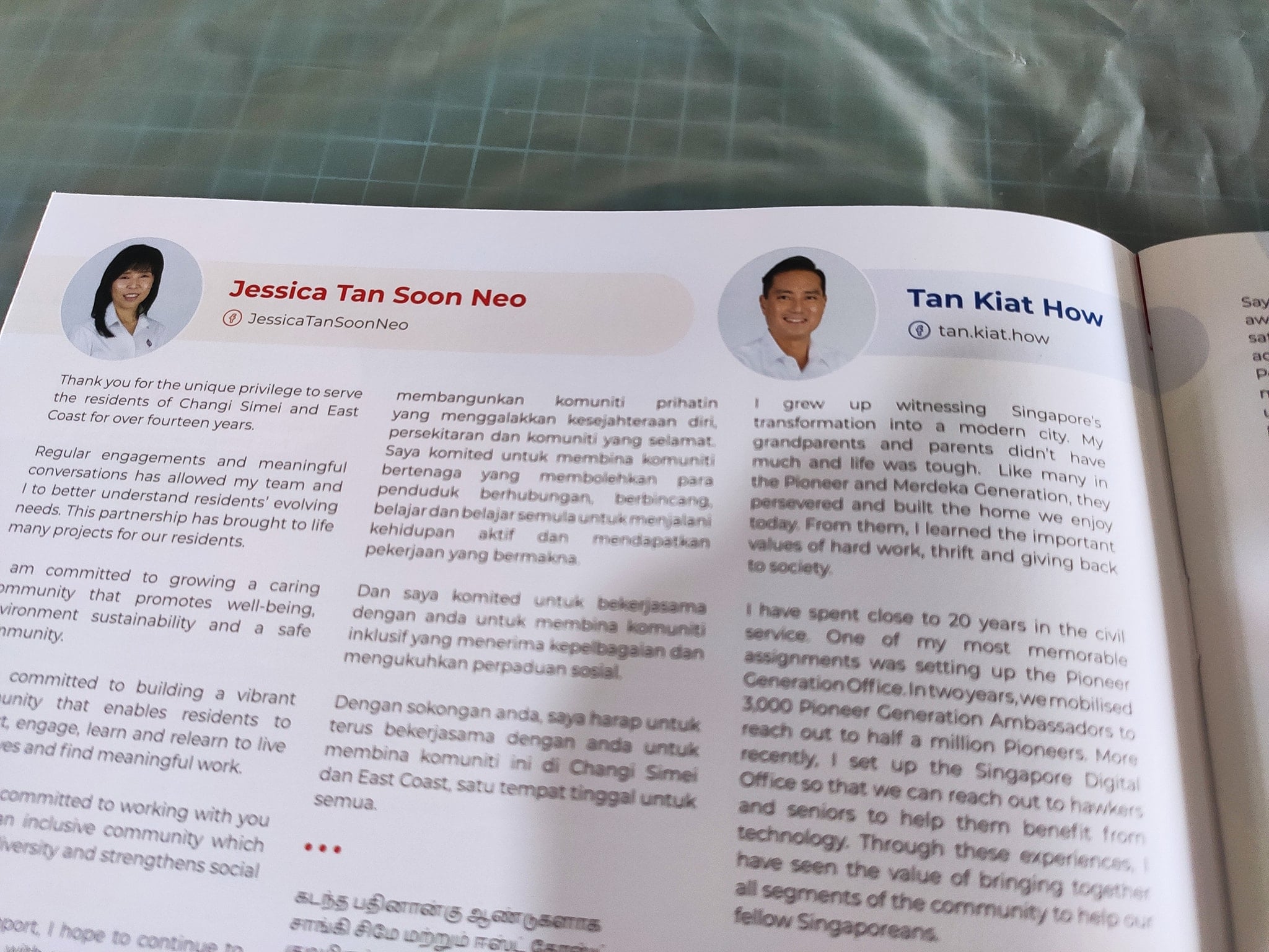
As for PAP’s brochure, the netizen shared that it was formatted in this order:
- English
- Chinese
- Malay
- Tamil
A practical choice as the party could have recognised that majority of voters are of Chinese descent.
As for Workers’ Party, they chose:
- English
- Malay
- Chinese
- Tamil
The netizen interpreted this as WP paying homage to Malay being Singapore’s national language.
However, he also made a disclaimer that he did not have access to other constituency brochures & thus could not ascertain if the order was specific to East Coast GRC.
Male vs female candidate distinctions
Red was the theme of choice for female PAP candidates, while male candidates’ text boxes were denoted by blue — with the exception of Mr Heng Swee Keat who had red text & a blue box.
As for WP’s brochure, there was no differentiation between male and female candidates.
Practical resident explains eventual fate of brochures
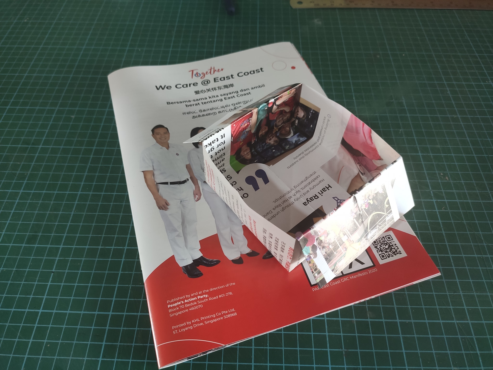
Finally, the OP shared that he knew how most households would attempt to recycle the paper brochures — as disposable peanut shell & snack trays.
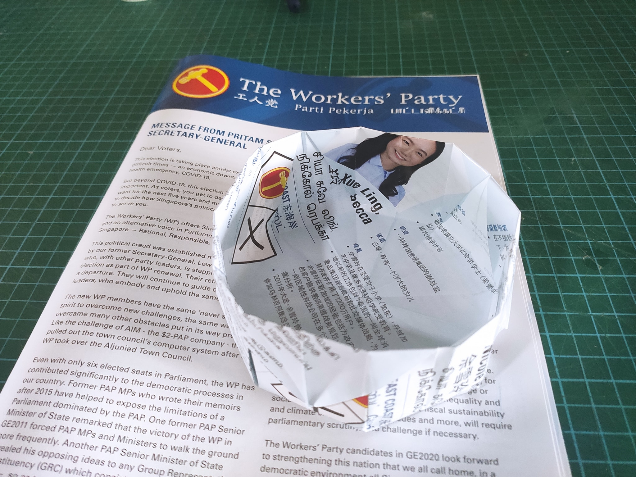
In his opinion, thanks to paper quality, PAP’s brochure would make “more colourful & sturdier” trays.
Paper tray supply renewed
Based on the design choices made by both political parties, we hope that they’ve successfully appealed to their voter base with their policies & brochures.
With that in mind, residents can take their decision to the polls in just 3 days — with sufficient peanut shell trays to last even after Polling Day.
Featured image adapted from Facebook.