
TikTok User Captures Mediacorp Channels’ Logo Changes On 1 Feb
Most Singaporeans who have watched shows by local media conglomerate Mediacorp within the past 24 years would probably be very familiar with the iconic logo designs unique to each channel.
If you have tuned in to their channels in Feb, however, you may have realised that these logos have been replaced.
Fret not if you missed the momentous logo change, as TikTok user LC took it upon himself to document the momentous logo changes of each channel, at 12 midnight on 1 Feb.
Tiktok user stays up till midnight to capture Mediacorp’s logo changes
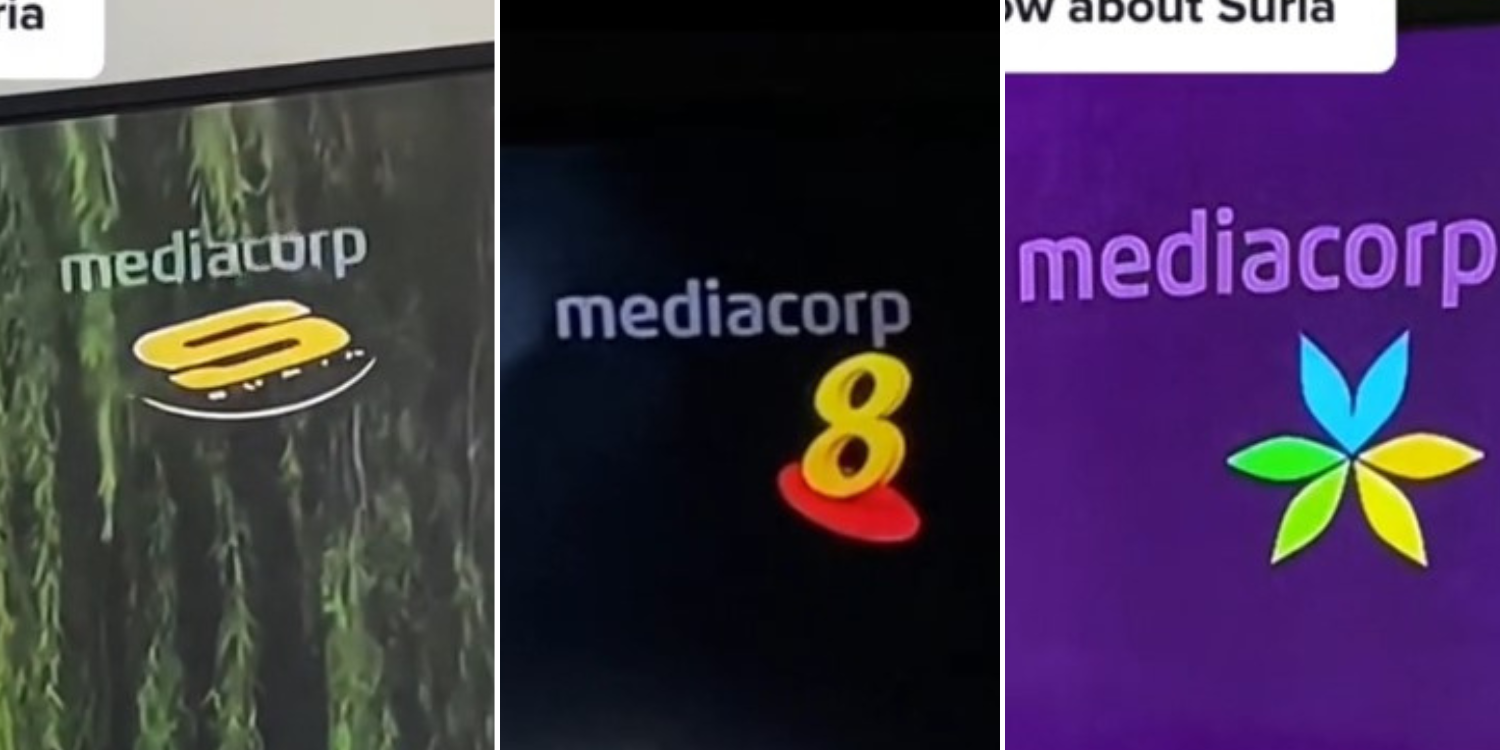
The clip showed LC tuned in to various Mediacorp channels right before 12am.
Source: TikTok
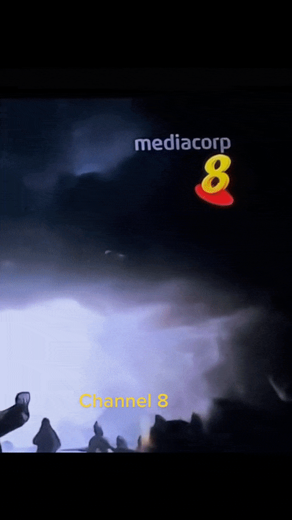
First up was Channel 8, followed by Channel 5 and Channel U.
On the dot, the Channel 8 logo began its switch to yellow, with an ‘8’ beside a yellow M sign. The other channels also retained their colours from before but now sport a sleeker, minimalist look.
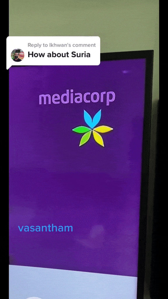
In a second video, LC also showed how the other channels switched their logos at 12am.
Mediacorp first announced their plans to change their logo through their media release on 16 Jan. The logo change was planned in a bid to “(strengthen their) collective presence and (showcase) the extensive reach of the entire media network through a harmonised and unified look.”
In their media release, Mediacorp teased their refreshed logos for all their channels, such as Channel 5, Channel 8 and Suria.

Source: Mediacorp
The new logos feature a standardised ‘M’ sign, coupled with simplified versions of the channels’ past logos.
What is interesting to note, however, is that the new logos are now animated, compared to the past static designs.
TikTok user wanted to capture “historic moment” when Mediacorp logo changed
LC told MS News that he decided to record the logo change as “it felt like a historical moment that (he) wanted to witness” because it was the first time the word ‘Mediacorp’ was removed from their logos, unlike the minor tweaks they have made in the past.
The graphic design student felt that the old logos’ three-dimensional designs and gradient colours made them stand out more than the new ones, but he also appreciated how there was now unity created with the standardised design.
Source: TikTok
“Well, I guess it would take some time for people to adapt and get used to the change, so there is always bound to be some uproar when familiar things are changed,” LC said of Singaporeans’ reactions towards the logo changes.
LC shared that he had fond memories related to the Mediacorp logos, such as playing tic-tac-toe on the old OKTO logo with his brother by drawing on their television with an erasable marker, and staring solely at the logos while horror shows were being aired.
Mixed reactions towards new logos
Many Singaporeans took to the comments section of his video to share their thoughts on the new logo.
Among them, there were many nostalgia-filled viewers who reminisced about how the old icons encapsulated their memories.

Source: TikTok
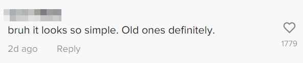
Others lamented that the new designs were too simple.
Source: TikTok
A minority, however, expressed that they preferred the new animations. Maybe things moving makes us notice them more.

Source: TikTok
While it may be difficult to come to terms with the rather drastic change in logos, perhaps this was a much-needed change to remind us how much Singapore television has developed over the years.
The old logos, however, will definitely have a special place in some of our hearts forever.
Have news you must share? Get in touch with us via email at news@mustsharenews.com.
Featured images adapted from TikTok and TikTok.