Sengkang Town Council’s Winning Logo Design Chosen As It Best Represents Town’s Character & WP Values
Born in March after recommendations by the Electoral Boundaries Review Committee, Sengkang Group Representation Constituency (GRC) is Singapore’s youngest GRC.
It’s also the most compelling as just months after it was created, it was snatched up by the Workers’ Party (WP) in a still-unbelievable shock result.
Now, the new MPs have the exciting responsibility of creating a town council from scratch.
One of the things that needed to be done is to create a new town council logo, so back in August, a logo design competition was held to let the people have a chance to decide on it.
The winning logo design has now been announced in a Facebook post.
New logo reflects Sengkang’s character & WP values
On Friday (23 Oct), Sengkang GRC unveiled the official logo on its Facebook page.
It was chosen as the team felt it best reflected both Sengkang’s character and the values of the WP, it said.
Winner inspired by greenery & buildings
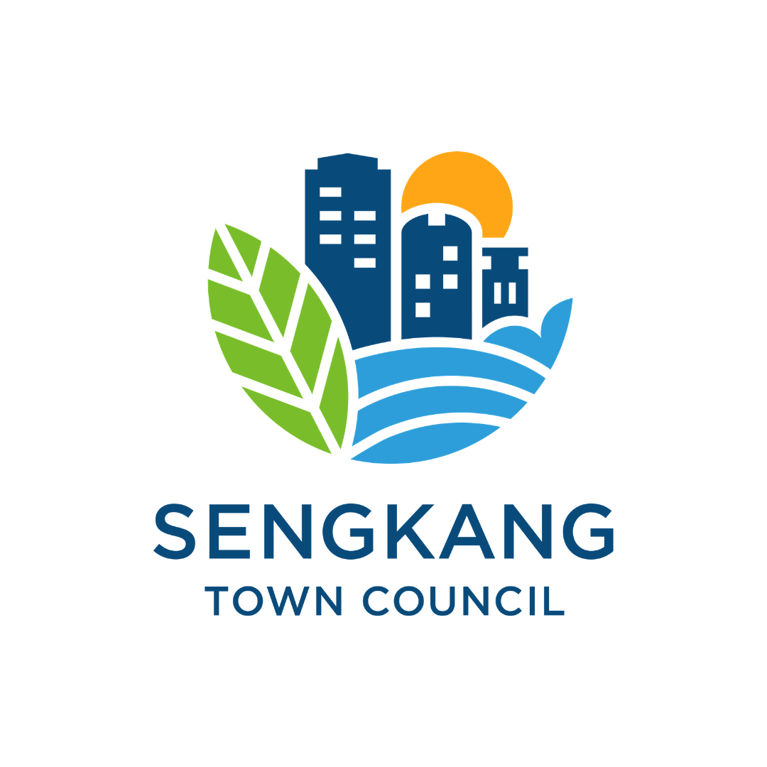
The winner, Ms Kelly Hah, was inspired by the lush greenery of Sengkang Riverside Park as well as the unique HDB estates in the GRC.
Sengkang’s location between 2 rivers was also represented by the light blue portion of the logo.
Additionally, there’s the shape of a whale’s tail in the water — it’s meant to stand for the Sengkang Sculpture Park.
The circular shape of the logo moreover symbolises the inclusivity of the Sengkang spirit and livability of the estate.
Ultimately, Kelly aimed for the logo to encapsulate Sengkang Town as,
an inspiring and caring home for all generations, and where our dreams can be fulfilled.
Winner offered design mentorship and prize money
The winning design was picked with the help of creative agency, BLACK.
The input from its team of designers contributed to the final logo design.
Thus, as the winner, Kelly won’t just get bragging rights and the exciting prospect of seeing her very own design on buildings, official documents and social media.
She’ll also be offered a mentorship by local designer Jackson Tan from BLACK.
Oh yes, not to mention the sum of $500 too.
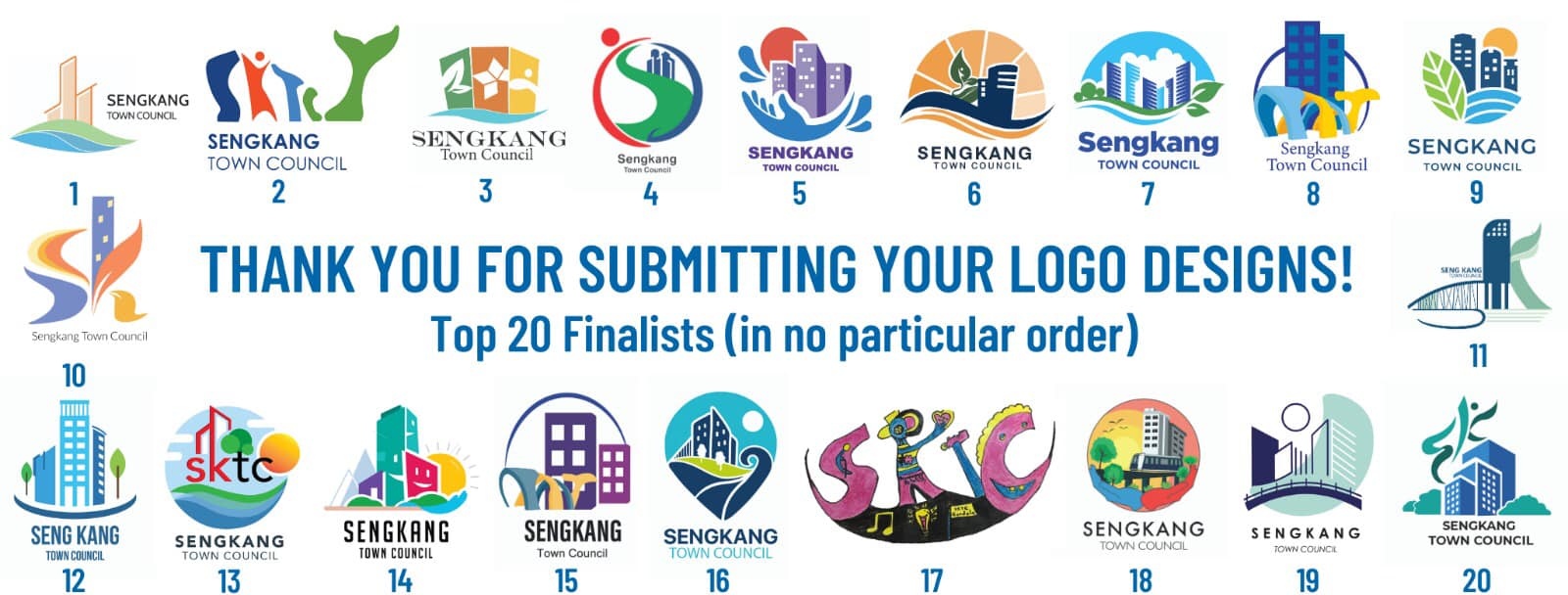
Winner chosen from 419 submissions
Kelly’s logo design had tough competition — a total of 419 entries were submitted.
They were narrowed down to the top 20 finalists, which were announced on 20 Sep.
Thanking all participants, the Sengkang GRC team shared that they thoroughly enjoyed looking through the submissions.
More exciting things to come
MS News congratulates Kelly for winning the logo design competition.
We hope the new Sengkang Town Council logo will augur the beginning of more good things to come for the young GRC.
And in Kelly’s words, hopefully the youthful town will continue to inspire and be a caring home for all generations.
Have news you must share? Get in touch with us via email at hello@mustsharenews.com.
Featured image adapted from Facebook and Facebook.
