Proposed Repainting Works For Tampines HDB Blocks Inspired By Ludo Chess
Tampines is no stranger to vibrant colour schemes for its buildings, with red lift lobbies for a Build-To-Order (BTO) project in the area going viral earlier this year.
Now, another set of HDB blocks is ready to sport a new look. And this time, it could be inspired by Ludo Chess.
MP for Tampines GRC Baey Yam Keng revealed that the courtyard and walls between Blocks 480 and 484 would undergo repainting works.
Residents can vote on the scheme they want, choosing between a vibrant or a muted version.
Tampines HDB blocks undergo repainting works in Ludo Chess style
Posting to Facebook on 4 July, Mr Baey shared that Tampines North’s latest set of upcoming repainting works will include a new, colourful look.

Source: Facebook
The designer will be repainting the walls and courtyard between Blocks 480 and 484 under the Neighbourhood Renewal Programme.
Source: Facebook
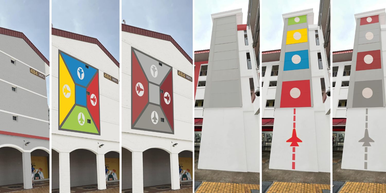
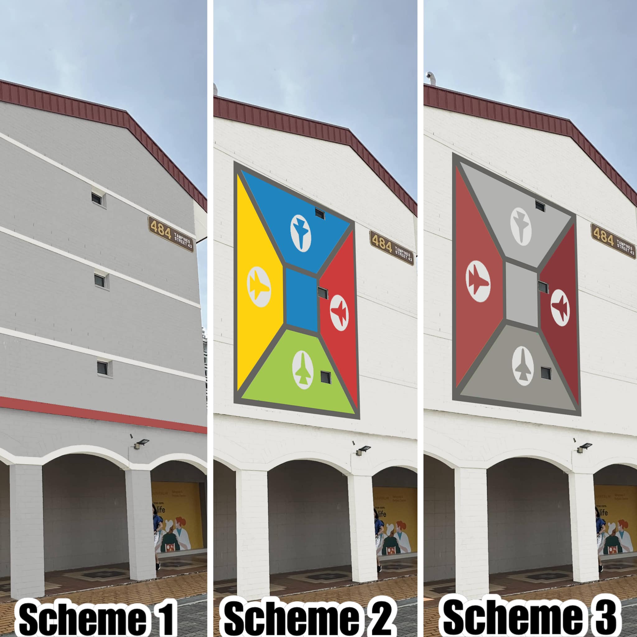
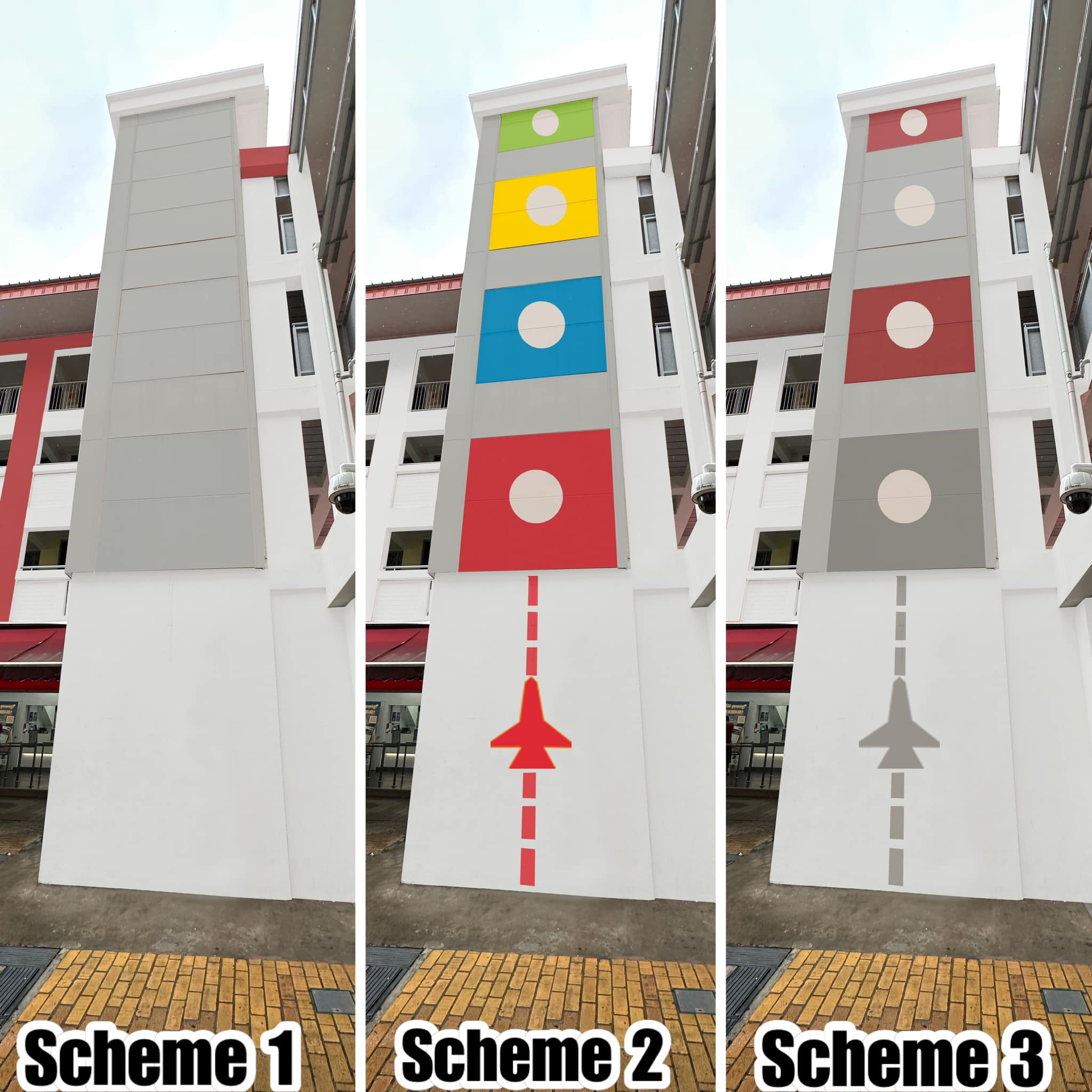
Following a Ludo Chess-inspired theme, there will be three schemes to choose from. Scheme 2 involves a vibrant look, with bright yellow, green, red and blue colours and a red airplane.
Meanwhile, Scheme 3 feels more muted with its dark grey and red colours.
Source: Facebook
For those disinclined towards either scheme, Scheme 1 is available, which involves the walls having their initial look, rejuvenated with just a fresh coat of paint.
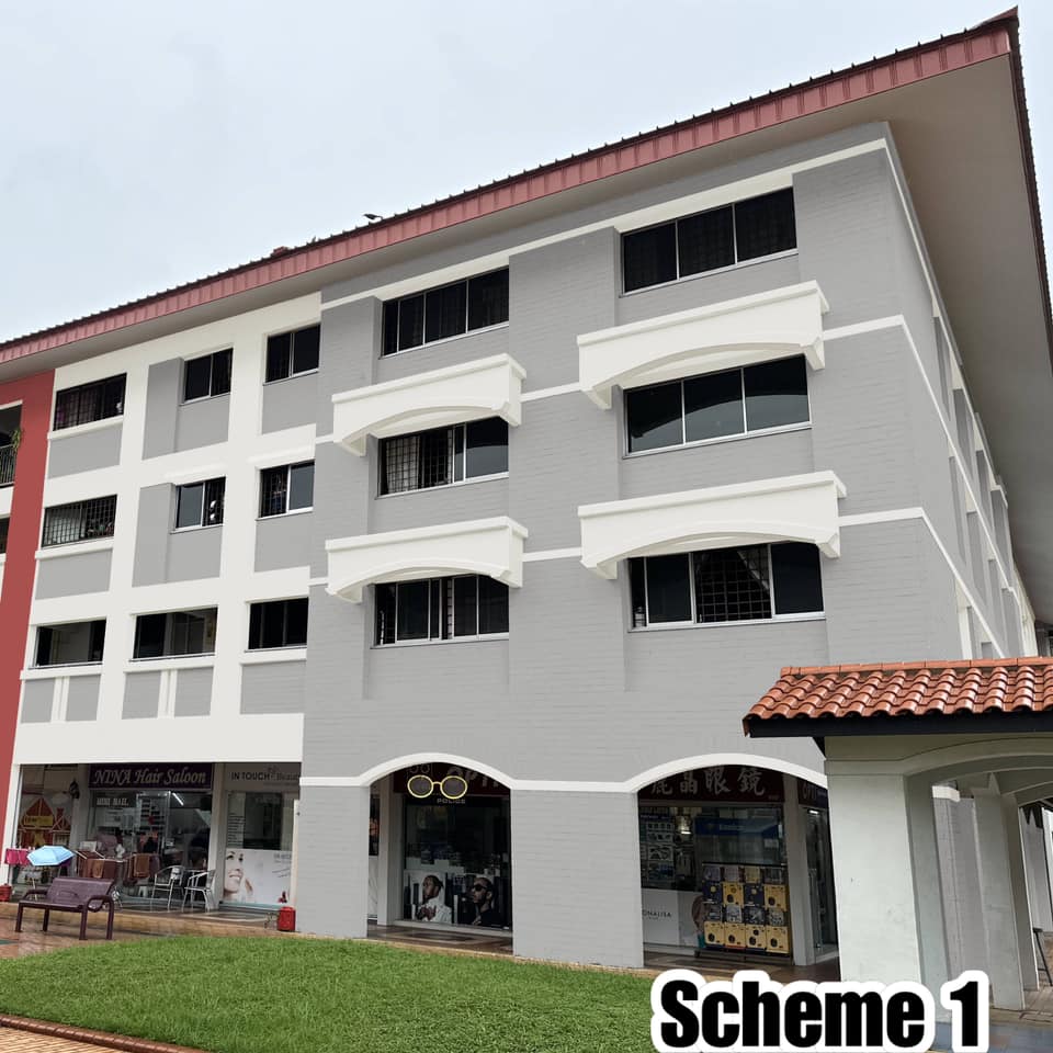
Source: Facebook
Residents can vote on which scheme they want
Mr Baey noted that each household would have received a form which they could use to vote on the look they preferred the most.
A colour palette would be available at every void deck for them to come to the appropriate decision.
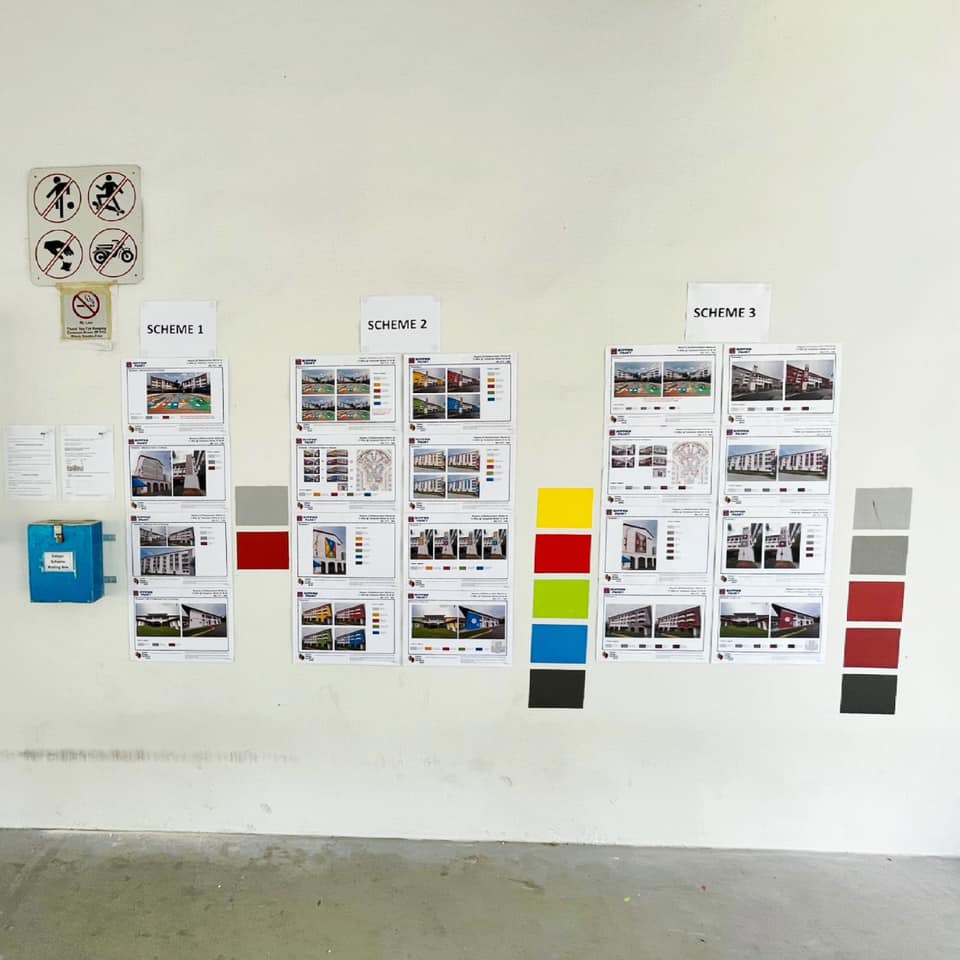
Source: Facebook
After indicating their preference among the three, they should place the form in the box beside the palette by 16 July. Tampines Town Council will then use the scheme with the highest votes.
Redditors have since reposted the news to their social media site, where they expressed their thoughts on the poll.
One user shared that they felt it was a step in the right direction, with the second scheme making the HDB blocks look “fresh”.

Source: Reddit
Others, however, felt that a monochrome style suited the buildings more.
As for Facebook users under the post itself, they seemed to have approved of the attempt at vibrancy in the neighbourhood.

Source: Facebook
A bold take on the neighbourhood
With concerns about the backlash against the red walls of the BTO earlier this year, it’s gratifying to see that the innovative thinking behind the design of buildings in the neighbourhood hasn’t been stifled.
This time round, residents would also have the chance to vote on the look they desire the most, which must be a relief.
Which colour scheme do you prefer? Share your thoughts with us in the comments below.
Have news you must share? Get in touch with us via email at news@mustsharenews.com.
Featured image adapted from Facebook.
