McDonald’s Has New Packaging Redesign With Cute Food Pictures
Brands around the world have recently adopted a more minimalist look for their packaging, and perhaps less is more these days.
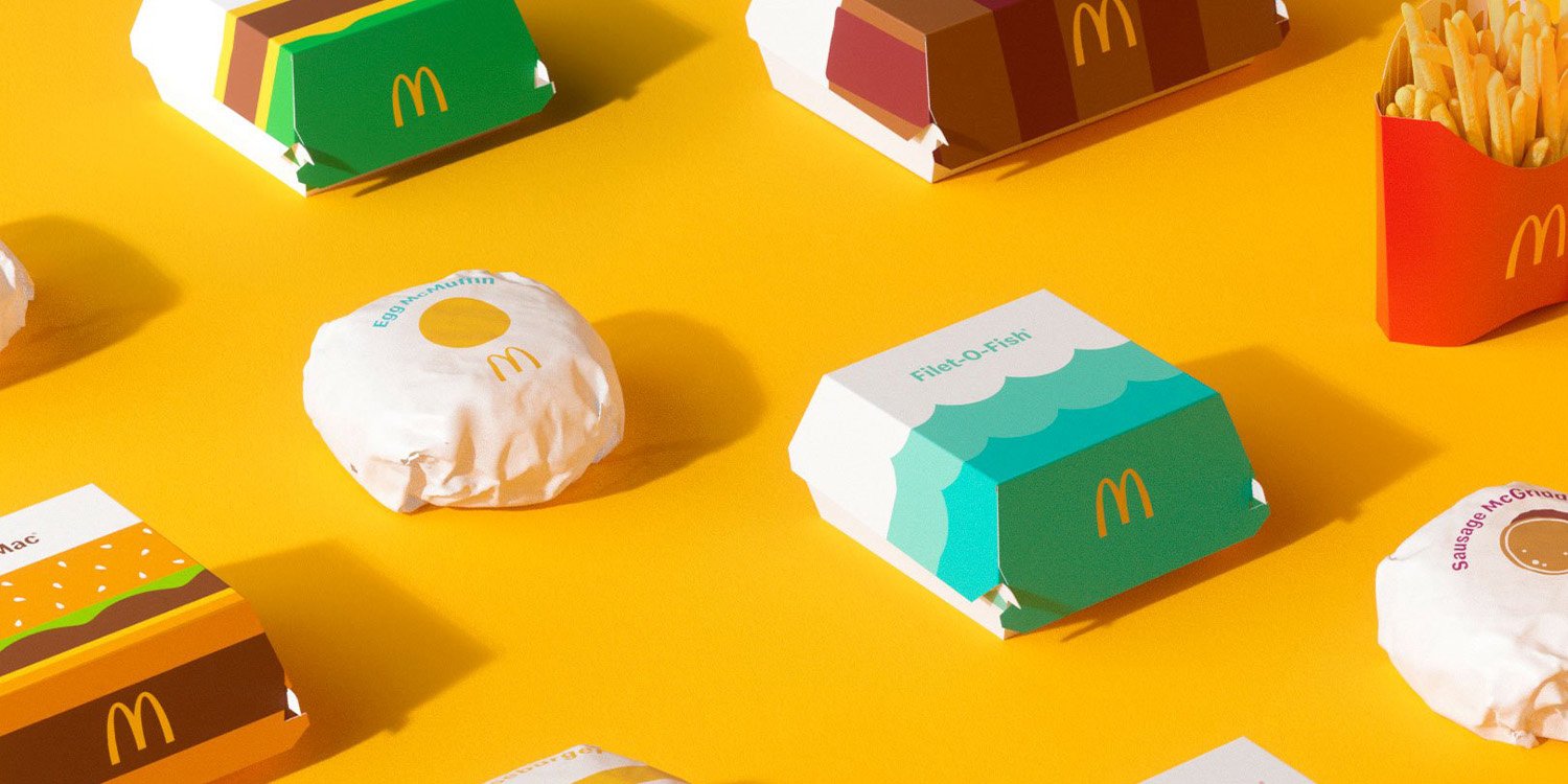
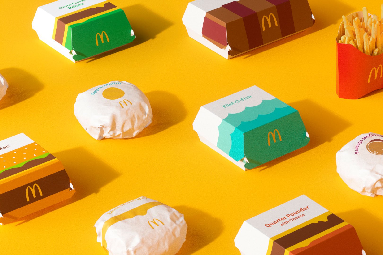
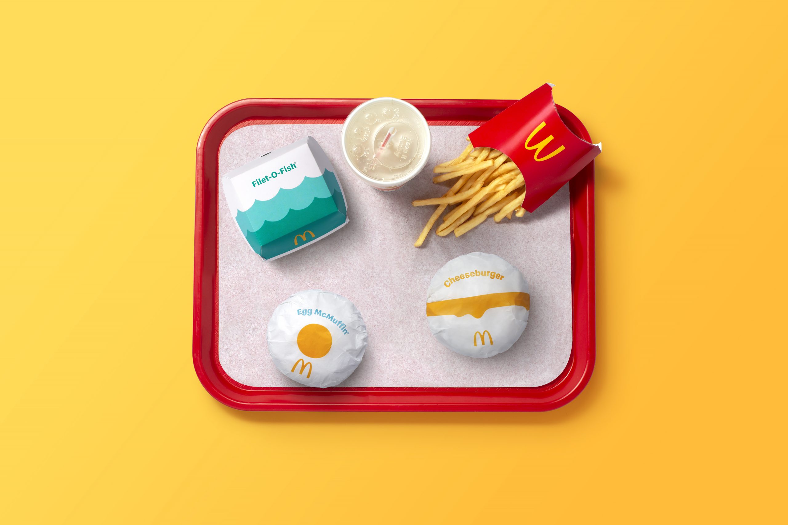
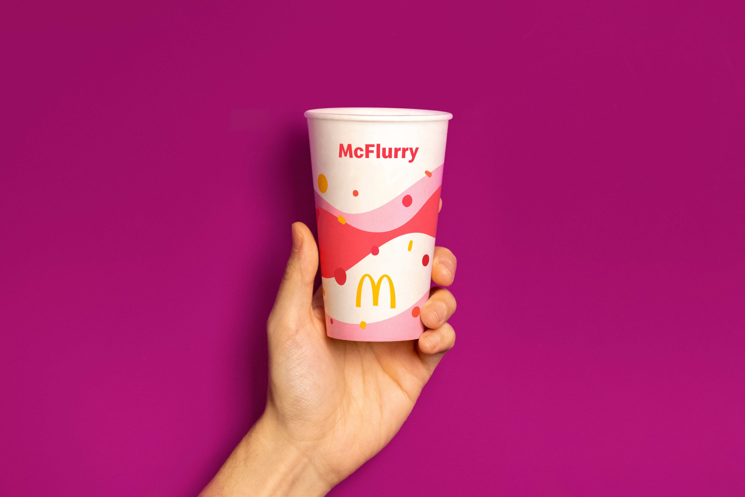
McDonald’s recently announced that their new packaging will be more playful, with cute renditions of their renowned food getting the spotlight.
We might be seeing this redesign in our shores soon, as a McDonald’s spokesperson told MS News that they’ll roll them out later this year.
Have a look at the packaging that’ll adorn your Filet-O-Fish and Double Cheeseburgers below. We can’t wait for what the McSpicy in particular will look like.
McDonald’s has new cute packaging for redesign
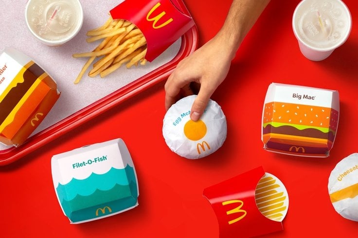
The McDonald’s redesign features playful renditions of food on their packaging.
For example, you can find a single yellow yolk on the Egg McMuffin, which combined with the shape of the burger and packaging colour makes it resemble a sunny-side-up.
You can see the Big Mac design resembles a burger with a sesame seed bun, with layers of green, brown and yellow to represent the other ingredients.
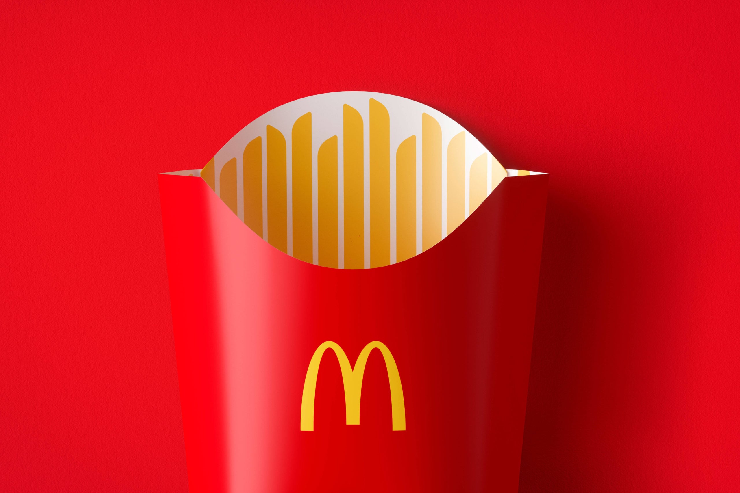
Another example is the fries packaging with golden sticks resembling fries on the inside.
Simple may be best
According to the studio behind the designs, they wanted to make something recognisable, yet simple and easy to understand.
And they seem to have found this in the designs, which are minimalistic yet easily identifiable as McDonald’s.
Can’t wait to see what McSpicy packaging will look like
As McDonald’s Singapore has unique specialities in their menu, such as the flaming McSpicy, there’s certainly anticipation on what that design will entail.
The McDonald’s spokesperson told MS News that they too, are excited about the happy and feel-good packaging designs.
For now, we’ll just have to wait and see when the designs arrive in Singapore.
Have news you must share? Get in touch with us via email at hello@mustsharenews.com.
Featured image adapted from Pearlfisher and McDonald’s.
