HDB Flat’s Industrial Design Includes ‘Danger’ Sign & Plastic Chairs Reminiscent Of Void Deck Events
Minimalist styles with industrial finishes are the go-to options for many HDB homeowners these days, who’ve found creative ways to design their abode.
Interior design firm Creatology Design Studio decided to take things a step further by incorporating a very Singaporean twist.
Keeping furnishings to an absolute minimum and using affordable options, we’re sure this will be well within anyone’s budget.
Industrial design makes HDB look like construction site
There’s quite a lot going on in their post today (23 Aug), showcasing artist impressions of a HDB flat’s interior.
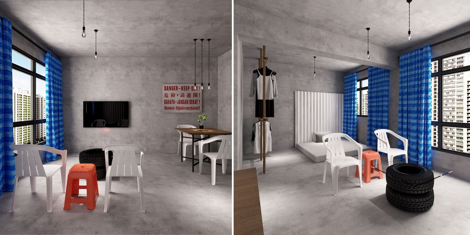
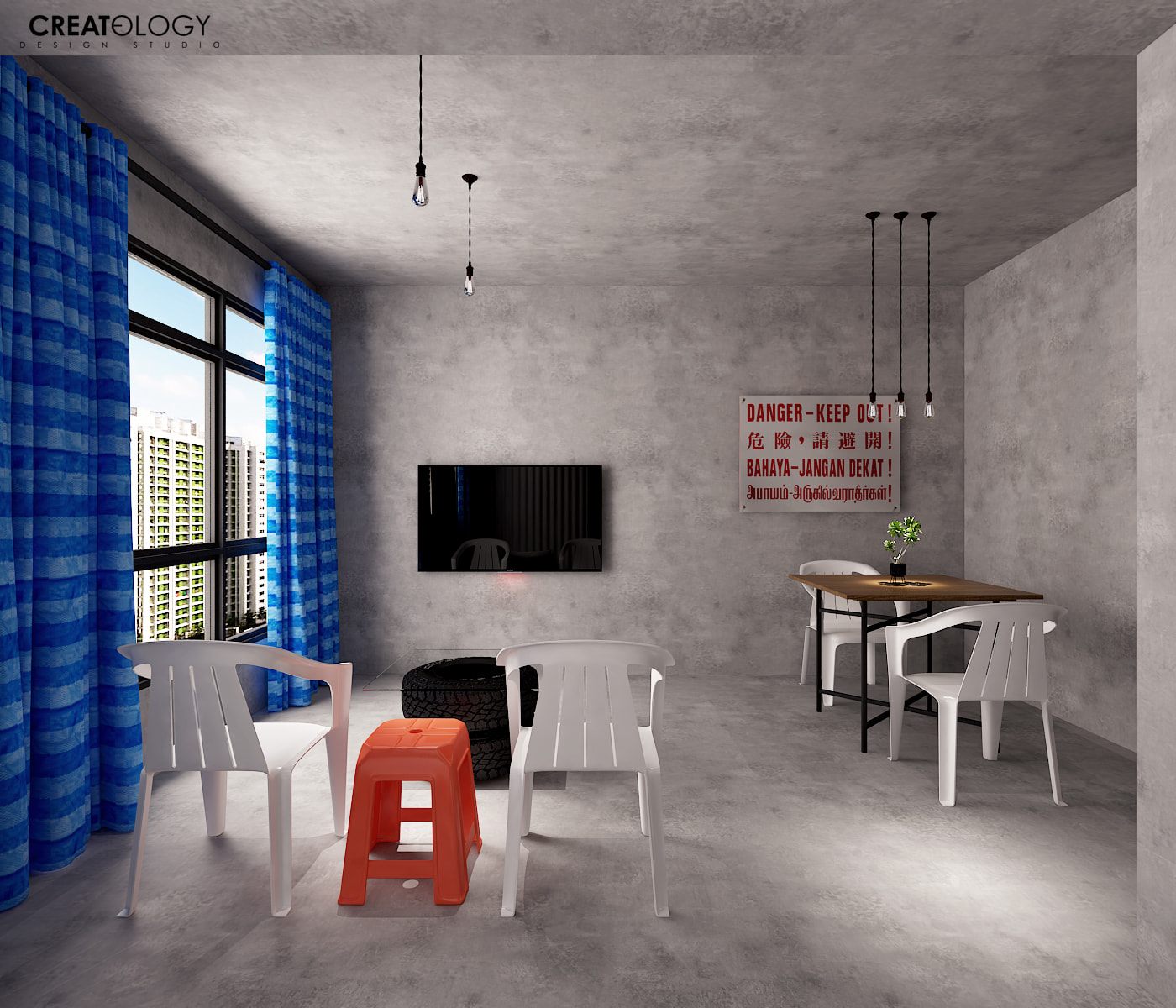
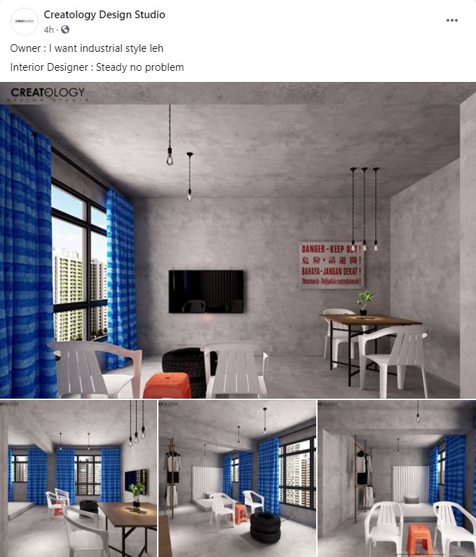
Let’s start with the main living area, which tries to marry different concepts together. At first glance, you’d immediately notice the concrete finish all around – literally – on the floor, walls and even ceiling.
Adding to the building-under-construction vibe is the “Danger – Keep Out!” sign on the wall in the 4 main languages of Singapore, which we often see at construction sites.
If that doesn’t scream ‘industrial’ enough, we don’t know what will.
Thankfully, softer touches like the bright blue curtains and potted plant on the table make the space seem a little more homey — though some may say the curtains resemble a certain striped blue canvas.
The exposed light bulbs hanging from black, iron rods are also a more boujee adaptation of glaring fluorescent lights.
Creative furniture innovations help save costs
Yes, we’re getting to the furniture, but let’s look at them from a different angle.
Plastic chairs and stools may not be the first things that come to mind when you think of home furnishing, but Creatology’s idea may make you reconsider.
Just look at the neat placement that makes them look like 2 armchairs and a mini side table — none of us would’ve thought of that.
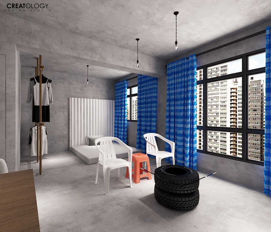
Even the random tyres with a tempered glass top transform into an unlikely yet functional coffee table.
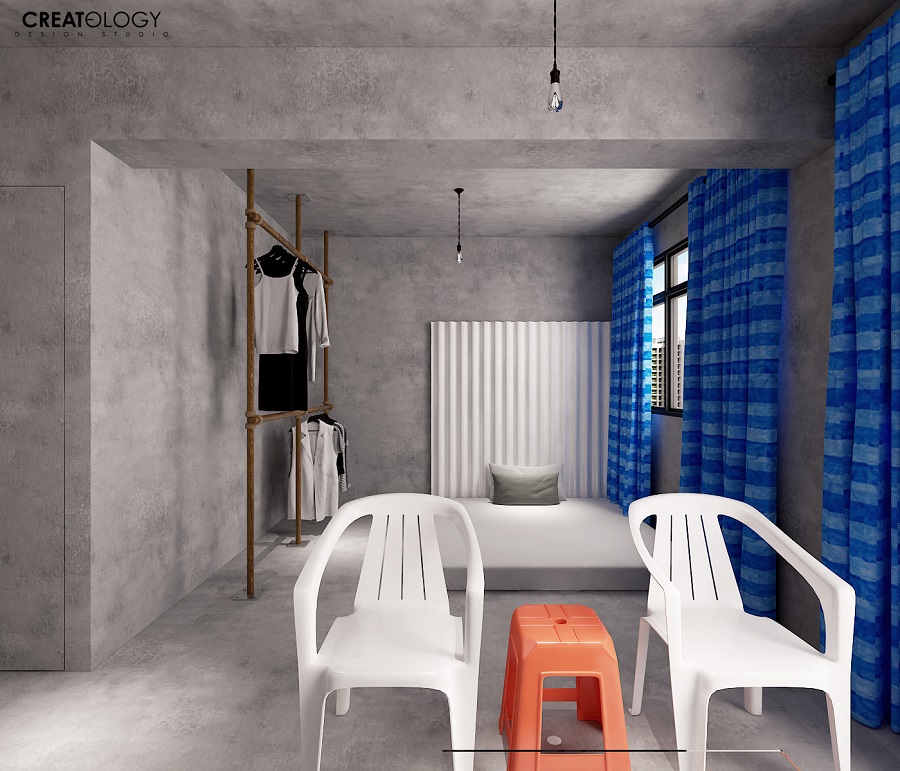
The open concept space extends into the bedroom, which is simply a queen-sized mattress on the floor, with a zinc square as its headboard.
Bed frames are so overrated, right? Apparently old-fashioned wardrobes are too, as clothes hang from open racks, which if you look closely, actually resemble construction site scaffolding.
Design idea in good humour, netizens amused
Of course, these aren’t illustrations of an actual HDB home design, rather a humorous idea by the brains behind Creatology Design Studio.
They even came up with a meme-like caption for the post:
If these folks can come up with such a creative concept for a joke, imagine how great the real deal may be if you consult them for design help.
So if you’re one to have some wacky ideas for your home, you know just who to turn to.
Featured image adapted from Facebook and Facebook.
