
TikToker flips out over PAP election booklet layout, calls out sloppy layout & inconsistent fonts
As Singapore’s General Election (GE2025) enters full swing, most residents are flipping through party brochures to read manifestos, but one TikTok user is flipping out over design choices instead.
Self-employed designer Eunice (@abcdeunice on TikTok) took to the platform on Sunday (27 Apr) to vent her frustration — not with politics, but with the People’s Action Party (PAP)’s layout decisions in their campaign booklet.
Designer points out design flaws in PAP booklet
In the video, Eunice — who lives in Tanjong Pagar GRC — made it clear that she wasn’t pushing a political agenda. She simply had a bone to pick with whoever designed the booklet.
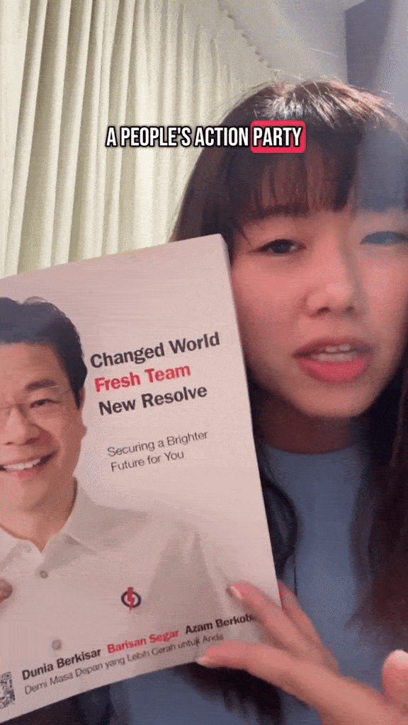
“One thing I do know is design, and I really want to critique this,” she said, showing the front page of the PAP booklet that she had recently received in her letterbox.
She suggested that the design team could have placed the PAP logo on the top right of the booklet’s front page, making it more prominent amidst the sea of white.
Source: @abcdeunice on TikTok
Eunice noted that the booklet focused too heavily on Prime Minister Lawrence Wong, with little visual representation of the rest of the team — an odd move for a party that emphasises the “People” in its name.
Source: @abcdeunice on TikTok
‘Why couldn’t you have justified the text?’
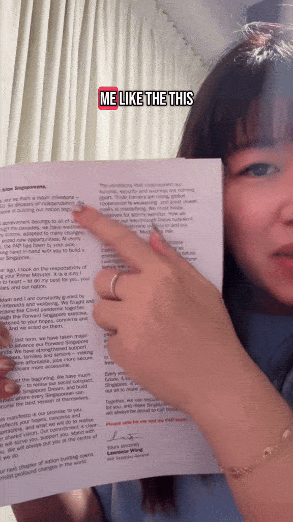
While flipping through the pages, Eunice did give credit where it was due, praising the large font size that made the text elderly-friendly.
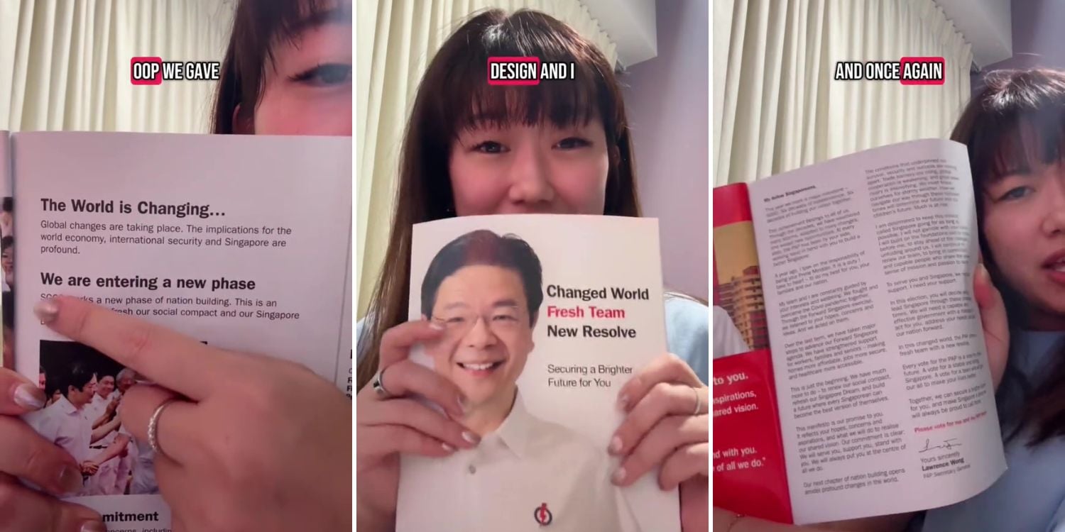
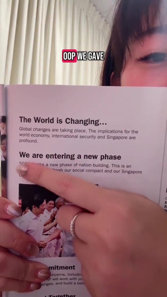
However, one thing that irked the designer was the text alignment.
“Why couldn’t you have justified the text?” she asked, as she showed lines in the booklet that jutted unevenly across the layout.
Source: @abcdeunice on TikTok
Capitalisation was another issue — with some headers oddly capitalising every first letter of each word, while others were in lowercase.
“We don’t like inconsistency,” she remarked.
Source: @abcdeunice on TikTok
Jarring amount of orphan texts
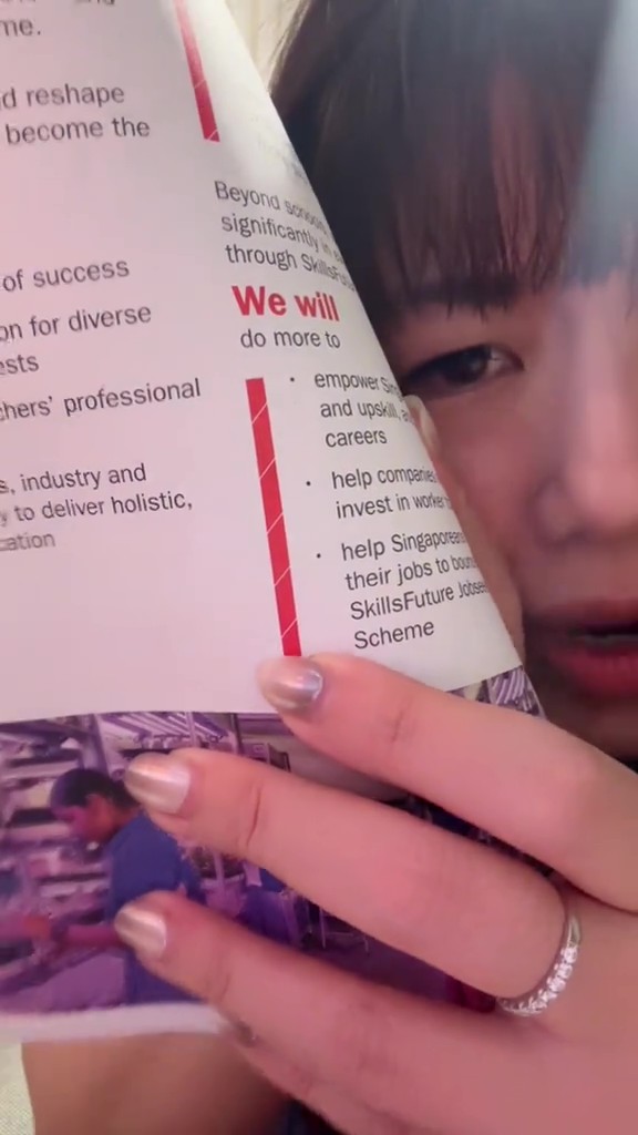
Although she is not a “perfect designer”, Eunice criticised the abundance of orphan text — a singular word dangling at the end of paragraphs.
Source: @abcdeunice on TikTok
“You could’ve easily nudged the line down,” she said, adding that it would’ve made the page look far cleaner.
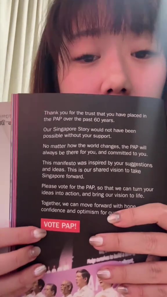
On the final page, where the words “Vote PAP” appeared in an isolated block, she questioned the sudden switch in formatting.
“Where in the previous pages have you used this design? Why the sudden change?”
Source: @abcdeunice on TikTok
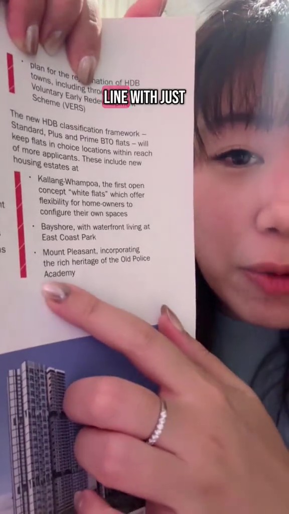
Frustrated, she flipped through the pages and also pointed out the sudden “striped” design that popped up mid-booklet,
“Are we in candy cane era?” she asked.
Source: @abcdeunice on TikTok
OP says feedback is about design, not content
Speaking to MSNews, Eunice clarified that her criticism is purely from a design perspective, not political.
So far, she’s only received the PAP booklet and hasn’t had the chance to review other parties’ collateral. But a brief scan online suggests other brochures also suffer from “quite shocking” design inconsistencies.
She added that to some, nothing might seem “off” with the design, but as a designer herself, these flaws really stood out to her.
Have news you must share? Get in touch with us via email at news@mustsharenews.com.
Featured image adapted from @abcdeunice on TikTok.